A PowerPoint feels boring when every slide looks the same: a topic label as the title, everything at the same weight, a block of bullets and no real picture. Changing the theme or adding animation does not fix that, because the problem is how the slide is built. What does work: lead with the finding, make the one number or image that matters very large, turn bullets into their real structure (a timeline, a comparison, a set of big numbers), use a real image or a creative graphic instead of an icon, give the cover and the section pages more drama than the body slides, vary layouts inside one visual system, and cut every element that carries no information. Below are eight fixes with real before-and-after slides from a sample manufacturing deck.
- 01
Why a slide feels boring: five causes
1) The title is a topic label (“Technology & R&D”), so the slide never says anything. 2) Everything has the same weight: same-size boxes, same-size text, nothing leads. 3) The content is a wall of bullets, and a wall of text usually hides a structure such as a sequence, a set of parallel tracks or a comparison. 4) There is no real image, or only a small stock photo in a corner. 5) Every slide uses the same layout. Fix the cause that applies, and the deck changes; swap the template and you keep all five.
- 02
Fix 1: Lead with the finding
Rewrite each topic-label title as the sentence you want the audience to leave with, and keep the old label as a small line above or below it. “Technology & R&D” becomes “R&D investment above benchmark fuels full innovation pipeline.” Read in order, the headlines should tell the whole story. This is the cheapest fix and the biggest one, but it changes wording, so use it where you are allowed to edit text and keep it a faithful reading of the slide's own numbers.
The nine rules behind a professional-looking deck → - 03
Fix 2: Make one thing huge
A key number should sit at the top of the type scale, far larger than anything else, with its label small underneath. The size gap does the work; color does not. When several figures are equal in importance, enlarge and bold them all in the same neutral ink instead of coloring one. In this sample company-profile slide the original is a single block of lines with the four figures buried in it. In the redesign, 450 million, 100+, 2000+ and 20,000 m² are set large in a grid on the right, a large headline sits on the left, and a new image runs along the bottom. All four figures and their labels are still there. The photo was replaced by a newly generated container scene that carries the company name, which is a visible difference from the original and one to check when a photo matters.
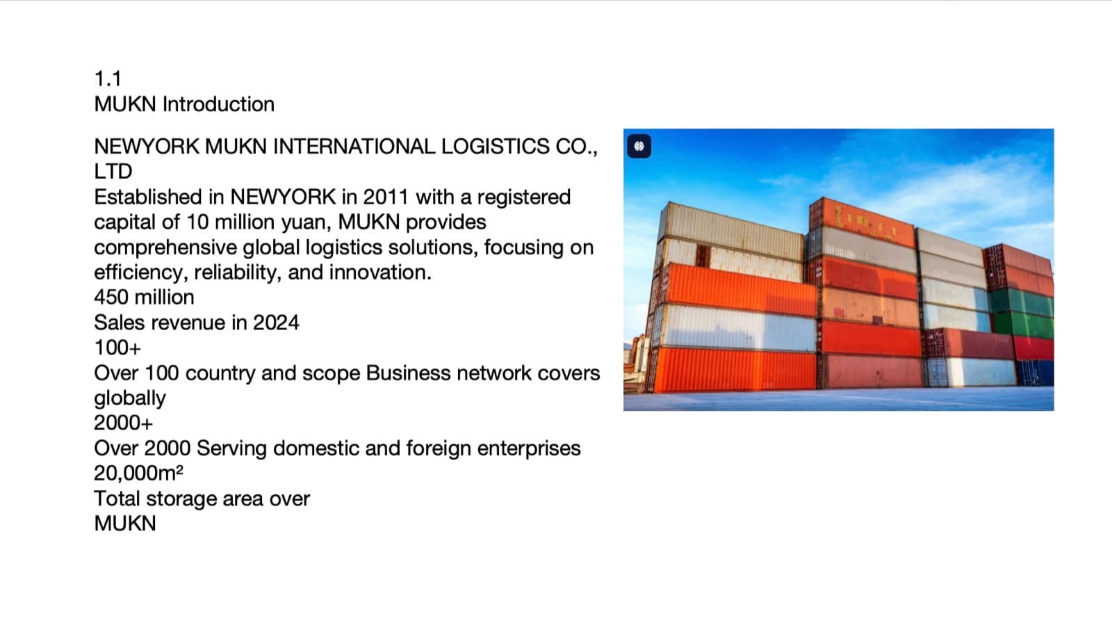
Before: the figures buried in one block of text beside a small photo 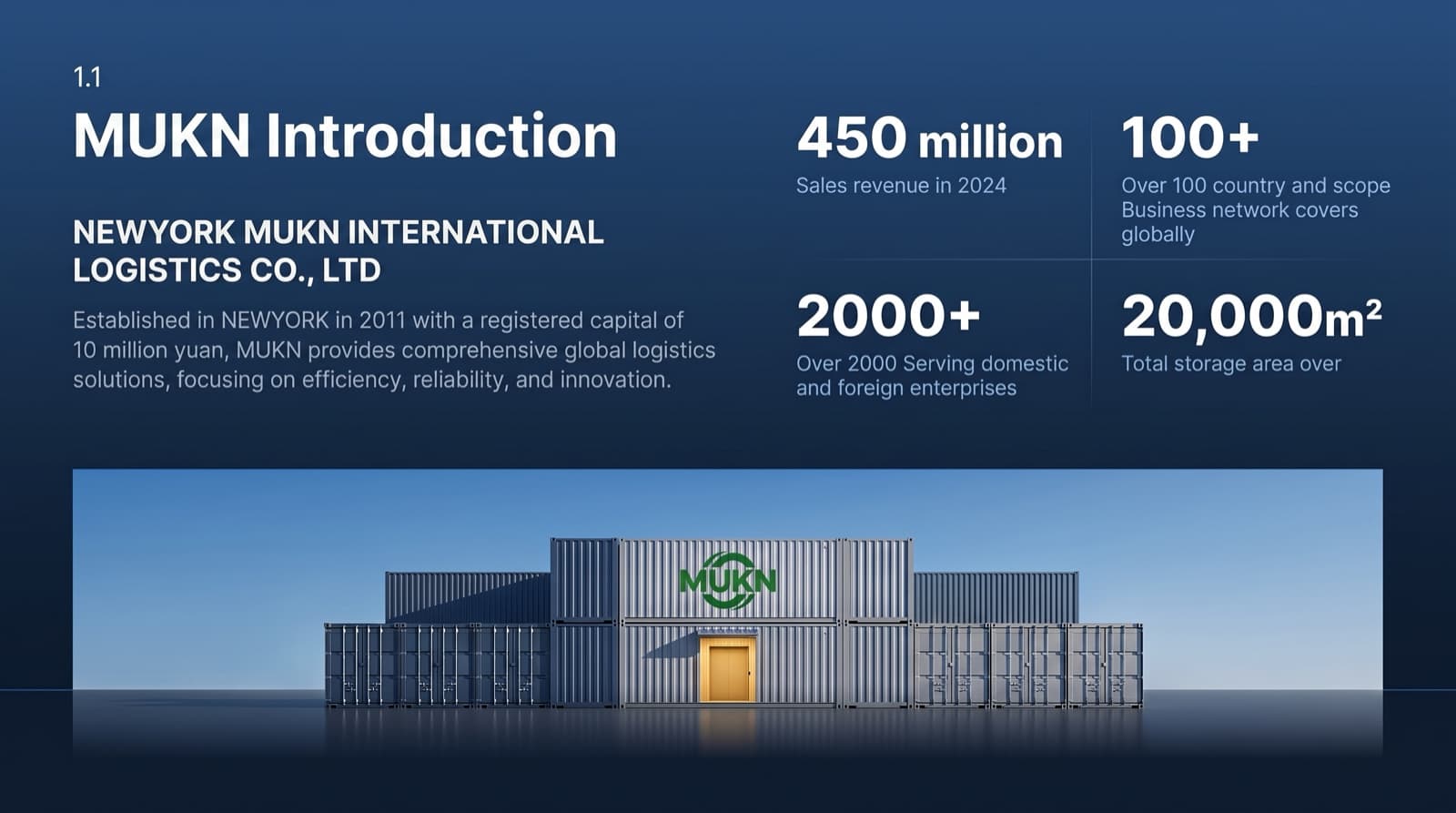
After: four figures set large, a headline, and a full-width image - 04
Fix 3: Find the structure hiding in the text
Before you design anything, read the bullets and ask what shape they are. A sequence is a timeline, parallel tracks are columns or swim lanes, before-and-after changes are a matrix with an arrow per row, and a ranking is a bar chart. Then give that shape a physical form. The test for a timeline is simple: if you could draw the same axis in Excel, it is not designed yet. An axis can be a road, a river or a line of light that also carries the story. In the pair below a five-row table of project phases became a timeline on one line: the phase names and all five date ranges are identical, the long descriptions were condensed, and a forest background was newly generated (a forest is a common metaphor for growth). If you need every description word for word, keep the words and let the layout carry the shape.
Bullets to timelines and diagrams, and what changes →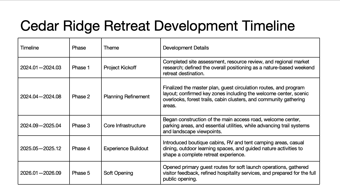
Before: a five-row table with long descriptions 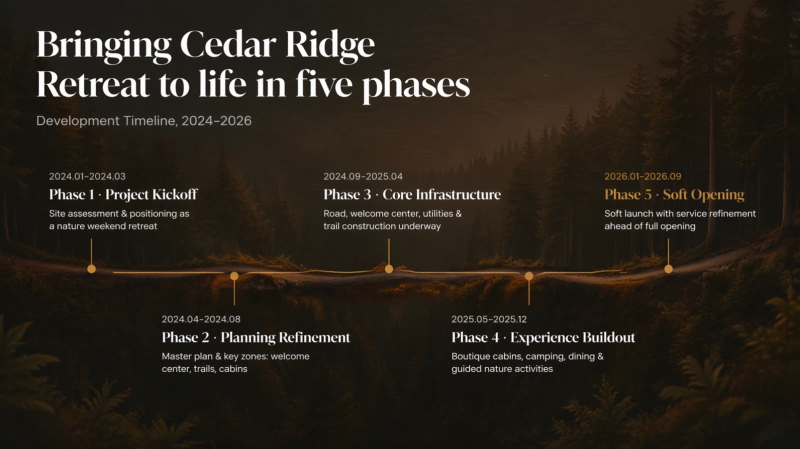
After: the same five phases and dates on one line, descriptions condensed - 05
Fix 4: Put a real picture on it
Make the hero a real image, not an icon or word art, and make it concrete: a country is a landmark, an industry is its real scene or product, an abstract metaphor becomes its real scene (a blue whale becomes a whale breaching a clean ocean). Then place the text on a quiet part of the picture, such as sky, a plain wall or water, and avoid darkening the whole photo. Give the image a role. If it is the content, it takes the center. If the slide is really data, the image sits behind it, far and soft. If it supports one claim, it takes a supporting pose and stays sharp. Keep the real photos of real people and real products: swapping your founder or your own product for a stock model or a generic render is the fastest way to lose credibility.
- 06
Fix 5: When there is nothing to photograph, draw a creative graphic, not an icon
Slides about a method, a mechanism, a policy or a process have no natural photo. A creative graphic can be the visual: one main object that stands for the idea, or one matching object per point in a single material. Choose one style for the whole deck and keep it: soft clay 3D, rounded 3D stickers, miniature scenes, matte 3D objects, frosted glass, 3D Memphis, fluid gradients or ink wash. Formal occasions such as a board update, an investor meeting or a client proposal suit a realistic single-tone miniature scene; frosted glass suits tech and AI; clay and stickers suit warm, educational or playful decks; 3D Memphis suits young, high-energy marketing. Two rules keep it professional: the object carries no text or numbers, and one page never mixes materials. If you want a pure-typography, consulting-style deck, skip this fix and let scale, weight and white space do the work. BetterPPT picks the creative style from your deck's tone and occasion, and you can name one in the configuration step.
- 07
Fix 6: Give the cover and the contents page the drama
The first and last slides are where the audience decides what kind of deck this is, and they are also where you can use the most image and the biggest type. The original cover below is four lines of text on white. In the redesign it is a full-bleed scene with the title set large in the calm dark area. Note what else changed: the redesign added an “Established 2008” pill, a “2025 EDITION” line and a logo roundel that were not in the original, which is the kind of addition to check for when text must not change. The contents page follows the same idea: not a plain list, but one atmospheric image with the numbers set very large and thin lines between the rows.
How to design a premium cover slide →
Before: four lines of text on white 
After: a full-bleed factory scene with the title in heavy white type, plus small added items 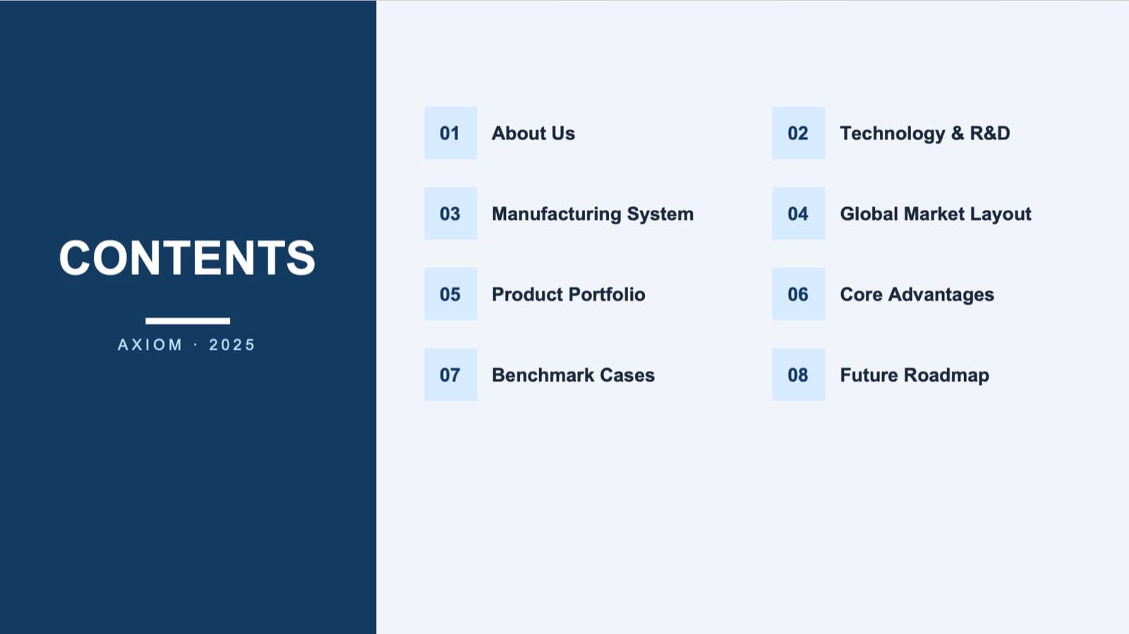
Before: a contents list with small number tiles 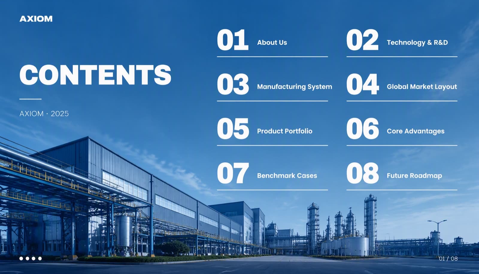
After: one full-bleed image, large numbers and thin lines, with the same eight items - 08
Fix 7: Vary the layout, keep one system
A deck of identical layouts is boring even when each slide is tidy. Let each slide's content choose its layout: a photo-led slide for a place, big numbers for results, a timeline for a sequence, a split for a comparison. Keep the system constant underneath: the same two typefaces, the same palette, margins and type ladder. Variety on top of a fixed system reads as intention.
- 09
Fix 8: Delete anything that says nothing
Every element should either carry information or go. Decorative shapes, extra icons, ghost watermarks in the background, gradient blobs and glow effects fail that test, and a card around every bullet is a container carried over from the old slide, not content. Fewer, larger things with space around them are what read as confident. Minimal is not the same as boring: a sparse slide with one clear focal point looks premium, while a sparse slide where everything has equal weight looks unfinished.
- 10
What does not fix a boring deck
A new theme, more colors, more clip art, gradients and glow, and animation on every bullet all add noise without changing the structure. They also raise the odds of the look people call AI smell: equal-weight rounded cards, small icons, headlines barely bigger than the body. If a change does not alter what the slide says first or how it is grouped, it is not a fix.
The six signs of AI smell, with before and afters → - 11
How BetterPPT does this for a finished deck
BetterPPT is an AI design agent that redesigns PowerPoint decks you've already written, every slide individually, and returns an editable .pptx. Avoiding a boring deck is what it is built for: specialised design skills and agents handle the different kinds of slide and build creative layouts around your topic, from a timeline drawn as a mountain ridge or a harbour curve to real scenes and 3D or miniature graphics. For each slide an agent works out the focus, picks the structure and writes a design brief, a deck-wide style step keeps the type, color and creative-graphic style consistent, and an image model draws the redesigned slide before the text is rebuilt as real text boxes. You decide how much wording may change. It will not suit a routine team update, charts that must stay native and linked to data, or a deck over 50 slides, and a 30-slide deck takes about 15–20 minutes.
How AI redesign of an existing deck works →
Questions
Why does my PowerPoint look boring even though the content is good?
Usually because of how the slides are built: topic-label titles, everything at the same weight, bullets that hide a structure, no real image and the same layout everywhere. Rewriting titles as findings, enlarging the one thing that matters and giving the content a shape such as a timeline or a set of big numbers fixes more than changing the theme.
How do I make bullet points more interesting?
Find the structure first. A sequence becomes a timeline, parallel items become columns or lanes, a before-and-after becomes a matrix, and numbers become big figures with small labels. Then give the shape a physical form and a real background.
Should I add animations or icons to make slides less boring?
Not as a first step. They add motion and decoration without changing the hierarchy. An element should carry information or be removed. Hierarchy, a clear focal point and a real image change a slide far more.
Can I make a boring deck interesting without changing my words?
Yes. Layout does most of the work: size and weight, grouping, a real image, a timeline or big numbers. Some fixes, such as turning a title into a finding, change wording, so skip them if the text is approved. BetterPPT offers keep every word, light editing and restructuring.
What is the quickest fix for a boring cover slide?
Use one strong image with a calm area, set the title very large and thin lines or small pills for the details, and remove decorative shapes. Check any added items against your original if text must not change.
How much does BetterPPT cost?
$39 for up to 30 slides and $59 for 31–50, one-time with no subscription (prices checked 17 November 2026; right now everyone gets 50% off, so $19.50 for up to 30 slides and $29.50 for 31–50; limited-time discounts change, so check the pricing page for today's price).
Bottom line
If you want the structure, the images and the hierarchy fixed on every slide of a finished deck without iterating in a chat, BetterPPT redesigns each slide individually and returns an editable .pptx. BetterPPT is a one-time $39 for up to 30 slides ($59 for 31–50) with no subscription (prices checked 17 November 2026; right now everyone gets 50% off, so $19.50 for up to 30 slides and $29.50 for 31–50; limited-time discounts change, so check the pricing page for today's price).
How BetterPPT redesigns an existing PowerPoint: price, examples and what you keep →