A premium PowerPoint cover has one focal point, usually the title set very large, on a photograph that has a calm area to carry it. The text is sorted into three levels: what this is (the title, kept exactly as written), what it is about (a subtitle one step down) and who and when (the smallest). The typeface is chosen for the mood, and decoration such as gradient backgrounds, geometric blocks and icons is left out. Seven rules below, with a real before and after: the original is four lines of text on white, and the redesign is a full-bleed factory scene with the title in heavy white type.
- 01
The example: four lines on white, then a full-bleed scene
The cover below is from a sample manufacturing deck. The original is the company name and three lines of text on a white background. The redesign draws a full-bleed factory scene with the title in heavy white type on the calm dark area at the left, a small kicker line above it, a subtitle one step down and two outlined pills below. The photo, not a shape, carries the page. One caution: the redesign added items that were not in the original (an “Established 2008” pill, a “2025 EDITION” line and a logo roundel), which is the kind of difference to check when wording must stay as written.

Before: four lines of text on white 
After: a full-bleed scene, the title in heavy white type, a kicker, a subtitle and two small pills - 02
Rule 1: Sort the text into three levels and let the title lead
Cover text falls into three buckets. What this is, the deck's name, is the main title and the single focal point; keep it exactly as written. What it is about is one line of positioning, one step smaller. Who, which occasion and when form the credit block, at the smallest size. The hierarchy runs main title, then kicker or subtitle, then pills, then fine print. Make the title at least about two and a half times the size of the supporting text, and much more when the copy is sparse. Use only information that exists in your source; if there is no date or presenter, do not add one.
- 03
Rule 2: Choose a photo that matches the subject and has a calm area
Make the picture read like a professional photograph, not a free template. If the deck is about a specific company, product or place, show that real subject; if not, use a scene that stands for it, such as a forest for growth or a port for logistics. The photo should bring its own quiet area, such as sky, a plain wall, water or soft blur, and the title goes straight onto it, so there is no color block or dark overlay behind the text. That is what makes a cover feel natural and grand: the words belong to the picture instead of sitting on a box laid over it. Keep real photographs of your own people, face unchanged, rather than swapping them for stock models. If your original images are low quality or clip art, replace them rather than polishing them.
- 04
Rule 3: Pick a layout from the picture, not a habit
A full-bleed photo with the title on its calm area is the default for a cover with a strong subject. If the subject fills the frame and there is no quiet area, split the page: image on one side, text on the other, with the scene continuing across the seam. A top and bottom split suits a medium amount of text. Corporate reviews and launches can use a composed key visual: a cut-out subject, a text area and a small information strip. Do not give every deck the same text-left, image-right cover.
- 05
Rule 4: Match the typeface to the mood
The typeface is a large part of how premium a cover feels, and it should follow the deck's mood. For impact, launches and sport use a heavy condensed or wide grotesque. For precision, tech and calm data-heavy decks use a thin geometric sans with generous letter-spacing. For heritage, luxury, fashion and editorial use a high-contrast serif with dramatic thin and thick strokes. For consulting and finance use a classic serif. For warm, education, health and family brands use a rounded sans at medium weight. The strongest move is contrast: an expressive title above a restrained, light body, rather than two loud faces or two flat ones. Choose one display face and one text face and carry them through the deck.
- 06
Rule 5: Match the temperature to the occasion
A warm, story-driven cover with a warm photo suits brand, travel, lifestyle and consumer decks. A default business-editorial cover is flat, with one small accent and a hierarchy of size and weight; most reviews, strategy and corporate decks live here. A cool, restrained cover with a squared grotesque and almost no decoration suits academic, government, finance and investor decks. Pick the tier first and the rest follows.
- 07
Rule 6: Put the details in small containers
Give the occasion or document type, such as ANNUAL REVIEW or DOCTORAL DEFENSE, a small kicker line above the title in small capitals with wide letter-spacing. Put the presenter, date and category in two or three small pills. Mark several authors with superscript letters. If you have a paragraph of introduction, compress it to one subtitle line or cut it. Each detail is real information from your source, which is why it earns its place.
- 08
Rule 7: Leave the decoration out
On a cover built around a photo, skip gradient backgrounds, geometric blocks and icon decoration; if the picture needs a seam, make it a defined edge such as one thin arc and not a feathered glow. Leave out faint watermark letters, stock-suit models and glowing circuit graphics. Use one emphasis device on the page, either a giant title, a big number, a block tag or plain white space, and put the accent color on one small thing only. For a text-only cover the same logic applies: let scale, weight and white space do the work.
- 09
Carry the cover through the deck
The contents page and section dividers should follow the cover's image, type and color, so the deck feels like one piece. In the sample deck the contents page in the redesign uses one full-bleed image with large numbers and thin lines, rather than a plain list with number tiles.
Eight fixes for a boring deck →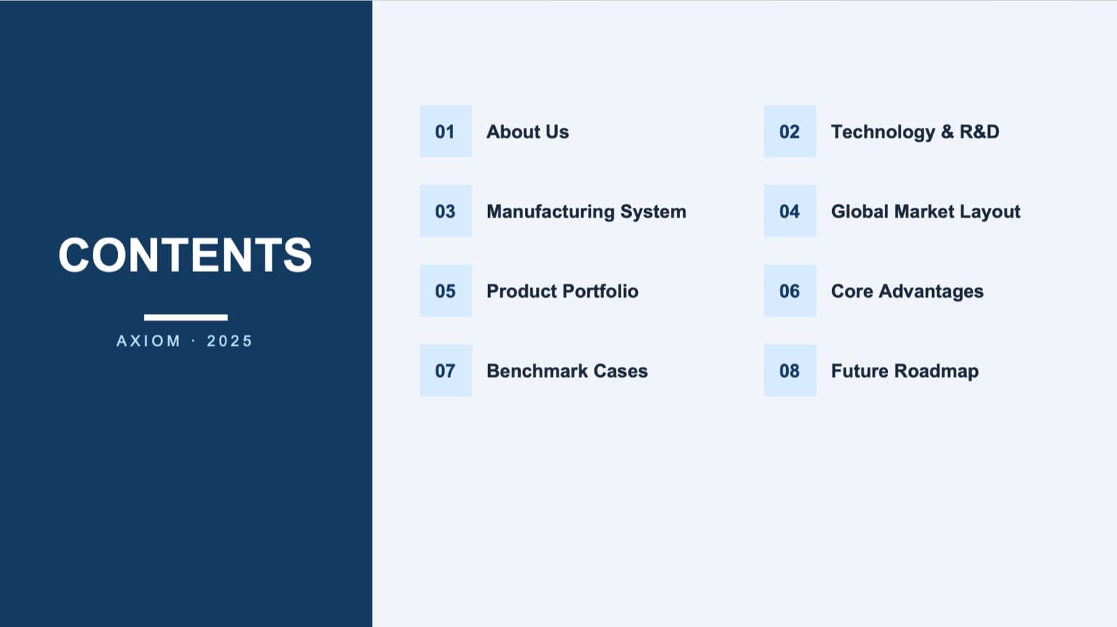
Before: a contents list with small number tiles 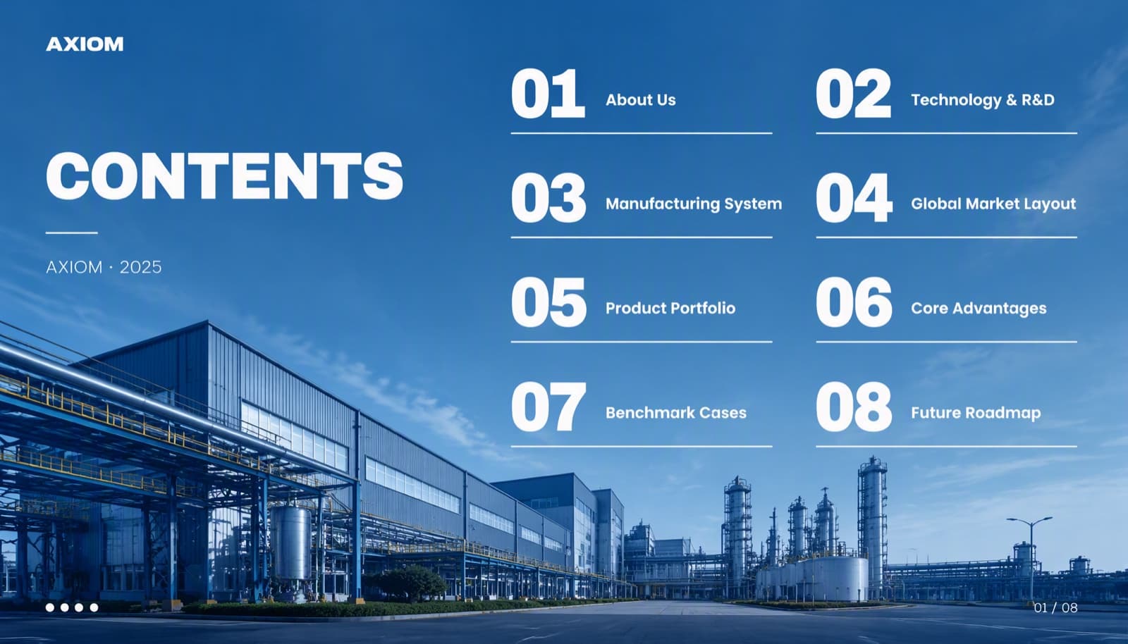
After: the same eight items over one full-bleed image, with large numbers and thin lines - 10
How BetterPPT designs covers
BetterPPT is an AI design agent that redesigns PowerPoint decks you've already written, every slide individually, and returns an editable .pptx. For the cover, the agent reads your original, decides whether the existing image is usable, keeps your real photos and logo, writes the design brief using the rules above and draws the new cover as one image, with the title placed straight in a calm area of the scene and no color block behind it. A deck-wide style step picks the typefaces, from a library of open-source fonts, and the colors. In English and other Latin-script or Korean decks the cover and closing page come back as editable text; a cover with Chinese, Japanese, Arabic or Cyrillic text, a logo wordmark or a full-bleed image page can still come back as part of the picture, with a notice before you download.
How AI redesign of an existing deck works →
Questions
What makes a PowerPoint cover look premium?
One focal point, usually a large title; a real photograph with a calm area for the text; a typeface chosen for the mood; details in small pills or a kicker line; and no decoration without a job.
Should I put a photo on my cover slide?
If the deck has a concrete subject, such as a company, a product or a place, yes: a real image makes the cover read as a professional photograph. For a text-only cover, a big title with white space and a thin rule can also look premium.
What fonts look premium on a cover slide?
It depends on the mood. A heavy condensed grotesque suits impact, a thin geometric sans with wide spacing suits precision and tech, a high-contrast serif suits luxury and editorial, and a classic serif suits consulting and finance. Use one display face and one text face for the whole deck.
How do I make text readable over a photo?
Choose or generate an image with a calm area, such as sky, a wall, water or soft blur, and put the text there. If there is no calm area, move the text to the emptier part or give it a solid block. Avoid a dark overlay across the whole image.
Will a redesign change the text on my cover?
The title stays as written. A design-led cover can add small items that were not in the original, such as a label or a badge, so check the result, and choose keep every word if the text must not change.
Can I edit the cover afterwards?
In English and other Latin-script or Korean decks, yes: the cover and closing page come back as editable text. A page with Chinese, Japanese, Arabic or Cyrillic text, a logo wordmark or a full-bleed image page can come back as part of the picture, with a notice before you download.
Bottom line
If your cover is four lines of text on white and the deck matters, BetterPPT redesigns every slide individually, cover included, and returns an editable .pptx. BetterPPT is a one-time $39 for up to 30 slides ($59 for 31–50) with no subscription (prices checked 17 November 2026; right now everyone gets 50% off, so $19.50 for up to 30 slides and $29.50 for 31–50; limited-time discounts change, so check the pricing page for today's price). It gives the most professional result of the four tools in our same-deck test; choose the strict keep-every-word option if the wording is final, refine any slide by typing an instruction in the chat box, and see the first slides in about 10 minutes (7–12 minutes in our recent jobs).
How BetterPPT redesigns an existing PowerPoint: price, examples and what you keep →