A manager's or director's deck looks senior when it answers first, carries one message per slide, makes the key number impossible to miss, cuts what does not help the decision, and looks the same from the first slide to the last. Junior decks usually do the reverse: they build up to the point, put several ideas on a slide, show every number at the same size and mix fonts, colors and margins. The seven moves below are design changes you can make on a deck that already exists, with a before and after for the data slide, and a quick routine for the night before.
- 01
Move 1: Answer first
Put the recommendation, the decision or the finding in the headline, and the support under it. “Revenue is 3% above plan, driven by two accounts” is better than “Q3 results”. Keep the old label as a small line so the facts stay. Leaders read headlines first and often only headlines, so make them carry the argument.
- 02
Move 2: One message per slide
If a slide makes three points, split it or choose the lead. A slide with a clear focal point, supported by a few grouped details, looks confident. A slide with six equal-weight items looks like a draft. When every word must stay, show the lead idea larger and the rest smaller, rather than deleting.
- 03
Move 3: Make the key number impossible to miss
Show the figure that matters at a very large size with its comparison next to it: against target, against last period, against the budget. Leave the rest of the table as a small supporting detail. Where a table is really about a comparison or a trend, turn it into a chart chosen for that question and label it directly. In the pair below, a plain table of survey results became a headline that states the finding, bars with each category labelled over its own segment and the extreme value highlighted. One column header was shortened in the redesign, so check labels when you compare.
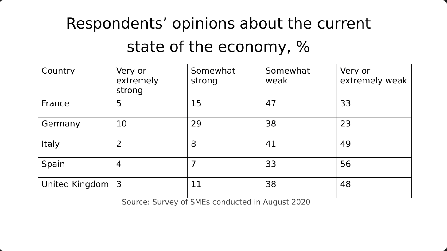
Before: a plain table under a topic-label title 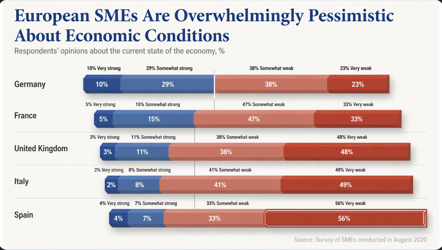
After: a headline that states the finding, bars labelled directly, the largest value highlighted - 04
Move 4: Cut what does not help the decision
Ask of every slide and every element what decision it supports. Background that the audience already knows goes to an appendix. Decoration that carries no information goes entirely. If the wording is locked, cut elements and containers, not words: boxes, borders, extra icons and repeated logos.
- 05
Move 5: Look like one deck
Two typefaces at most, a small set of colors, the same margins and the same type sizes for the same kinds of text on every slide. Inconsistency is the fastest way to look junior, because it is the first thing a senior reader notices without being able to say why. If your deck combines pages from several people, fix this first.
Making decks from several teams look like one → - 06
Move 6: Use space and scale, not decoration
Group related items close together and leave clearly more space between groups. Make the headline several times the size of the body. These two moves do more for a senior look than any icon or background. Add a real photograph from the business only where it helps the point, and put the title on a calm area of it.
Nine design rules behind a professional-looking deck → - 07
Move 7: Keep the cover and contents page calm
A restrained cover with the title, the occasion and the date reads as confident. For a contents page, three to six items with large numbers beat a long list in small type. Leadership does not need a roadmap of the deck, only the shape of the argument.
- 08
Reworking a deck the night before
1) Rewrite the headlines as findings. 2) Pick the lead idea on each slide and enlarge it. 3) Turn the key table into one large number or one labelled chart. 4) Remove boxes and decoration. 5) Fix fonts, colors and margins so they match. 6) Check every number against the source. If the content is final and you are short of time, a redesign is the fastest route.
Redesigning a PowerPoint tonight: what to do in the last hours → - 09
How BetterPPT does this for a finished deck
BetterPPT is an AI design agent that redesigns PowerPoint decks you've already written, every slide individually, and returns an editable .pptx. It is built for the stretch from a finished draft to a deck that looks senior. Each slide is drawn as one finished picture, so words and visuals are composed together: a title can sit straight in a calm part of a scene with no color block behind it, a timeline can be drawn around a scene that fits your topic, and your real photographs and logo are kept and improved. You choose how much wording may change, from keeping every word to restructuring, and a text comparison report lines your editable file up against the original. Your first slides (up to six) are ready in about 10 minutes (7–12 minutes in our recent jobs) and the rest of a 30-slide deck takes about another 10, and you see your own slides before you pay the rest. One-time price, no subscription. Charts and graphics become part of the picture, so you edit text in PowerPoint but not chart data.
How AI redesign of an existing deck works →
Questions
How do I make my PowerPoint look more senior for my boss?
Answer first in the headline, carry one message per slide, make the key number very large with its comparison, cut what does not help the decision, and make the whole deck consistent in type, color and margins.
What makes a deck look junior?
Building up to the point instead of answering first, several ideas on one slide, every number at the same size, and inconsistent fonts, colors and margins.
How can I make a quarterly update for leadership sharp?
Lead each slide with the finding, show the numbers that matter against target or last period, group the details and move background to an appendix.
Can I make my slides look professional without changing my content?
Yes. Layout does most of the work: scale, grouping, space, imagery and consistency. BetterPPT has a keep-every-word mode, and a comparison report to check the result.
What if I only have a few hours?
Rewrite headlines, enlarge the lead idea, simplify the key table, remove decoration and fix consistency. A redesign tool can do the layout work while you check the numbers.
How much does BetterPPT cost?
$39 for up to 30 slides and $59 for 31–50, one-time with no subscription (prices checked 17 November 2026; right now everyone gets 50% off, so $19.50 for up to 30 slides and $29.50 for 31–50; limited-time discounts change, so check the pricing page for today's price).
Bottom line
If leadership will see your deck and the content is final, BetterPPT redesigns every slide individually and returns an editable .pptx. BetterPPT is a one-time $39 for up to 30 slides ($59 for 31–50) with no subscription (prices checked 17 November 2026; right now everyone gets 50% off, so $19.50 for up to 30 slides and $29.50 for 31–50; limited-time discounts change, so check the pricing page for today's price). It gives the most professional result of the four tools in our same-deck test; choose the strict keep-every-word option if the wording is final, refine any slide by typing an instruction in the chat box, and see the first slides in about 10 minutes (7–12 minutes in our recent jobs).
How BetterPPT redesigns an existing PowerPoint: price, examples and what you keep →