An all-hands or company update deck works when it is readable from the back of the room, carries one idea per slide, shows progress with large numbers and real photographs of your own people and product, and tells a story in order. It looks professional when it uses one system of type and color throughout, and engaging when each slide has a clear focal point and the layout changes with the content: a big number for results, a photograph for a place or a win, a timeline for the plan. The sections below give the moves, with a real before and after for a company-introduction slide, and a way to rework last month's deck in an evening.
- 01
Design for the back of the room
People look at the screen from far away and from laptops. Keep body text large, headlines larger and figures largest, and keep contrast high: dark text on a light ground or light text on a dark ground, with nothing set on a busy part of a picture. As a rule of thumb, nothing the audience must read should be much below 18 pt, and 24 pt for body text is safer in a room. If a slide needs smaller text to fit, it carries too much; split it.
- 02
One idea per slide, in a story
Order the update as a story: where we were, what happened, where we are, what is next. Give each slide one idea and let the headline state it. Mixed audiences will not read paragraphs; they will remember a number, a picture and a sentence.
- 03
Show progress with large numbers
When you report results, set the key figures very large with a short label beneath. Where several figures are equally important, show them side by side in the same neutral ink. In the pair below, the original is a company-introduction slide with the figures buried in one block of text beside a small photo; the redesign sets four figures large, adds a clear headline and a full-width image. All the figures and their labels remain, and the image was newly generated to show the company name, which is worth checking when a real photograph matters.
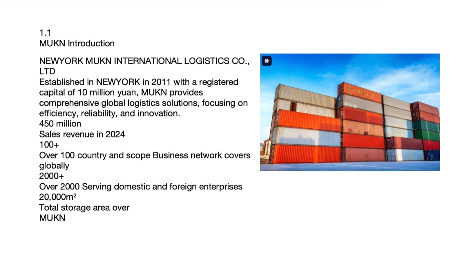
Before: the figures buried in one block of text beside a small photo 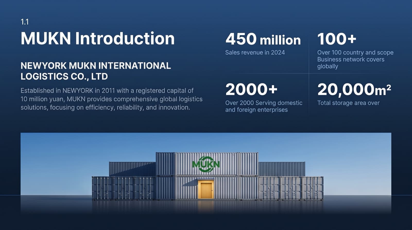
After: four figures set large, a headline and a full-width image - 04
Use your own people and product
A company update is the one deck where real photographs matter most: the team, the product, the customer site, the launch. Keep them and improve them, with brighter light and more room around the subject, instead of replacing them with stock images. Put titles on a calm area of the picture rather than on a block. Where a slide has no photograph, such as a plan or a principle, use one consistent creative graphic style or typography alone.
- 05
Show the plan as a timeline with a picture
A roadmap slide is where a table of dates usually lives. A timeline gives it a shape: an axis that follows a scene that fits the story, with milestones along it and the current date marked. The test is simple: if you could draw the same axis in a spreadsheet, it is not designed yet. Keep the dates and milestone names exactly as in your plan, and shorten descriptions only if you may.
Bullets to timelines and diagrams without changing a word →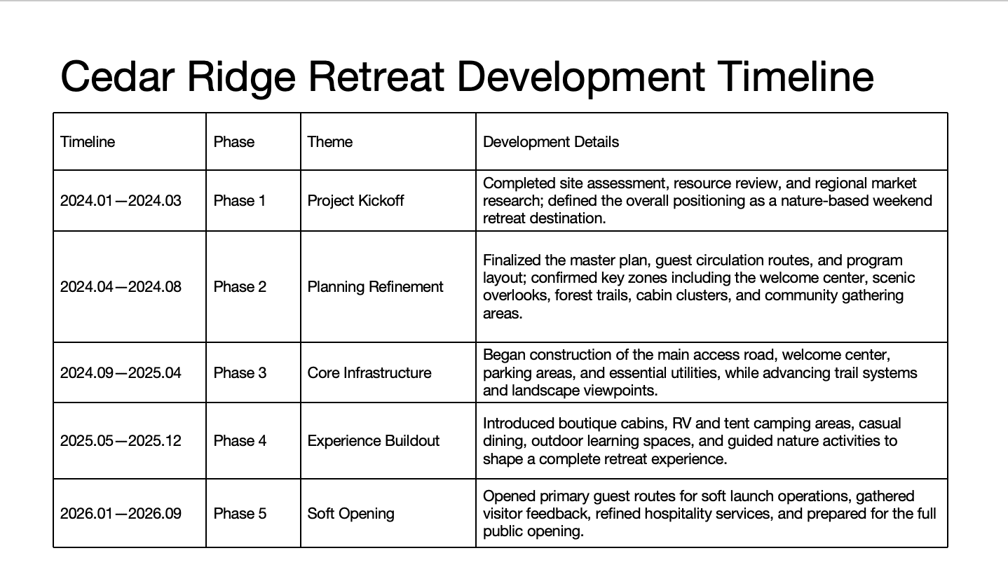
Before: a five-row table with long descriptions 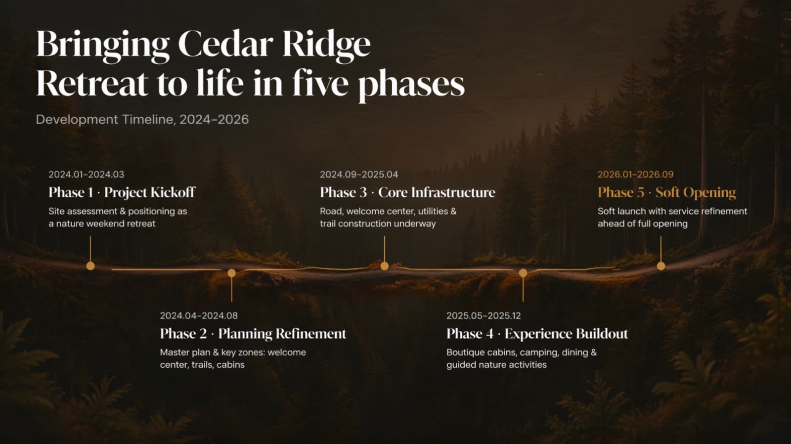
After: the same five phases and dates on one line, descriptions condensed - 06
Engaging without being childish
Warmth is allowed in a company update, and so is a creative graphic or a photograph with personality. Keep it from tipping into childish with a single style across the deck, a restrained palette and real imagery for the people. Avoid mixing sticker icons, clip art and different illustration styles on one slide. Fun and professional are not opposites, but a consistent system is what keeps the two together.
- 07
A repeatable template for the monthly update
If you present every month, fix the system once: the same typefaces, colors, margins and slide types for results, wins, plans and questions. Then each month you change content, not design. A redesigned deck that follows one system is easier to reuse than a collection of pages from different months.
Making decks from several teams look like one → - 08
How BetterPPT does this for a finished deck
BetterPPT is an AI design agent that redesigns PowerPoint decks you've already written, every slide individually, and returns an editable .pptx. It suits a company update that is written and needs to look designed, with big numbers, real photographs and timelines built around your story. Each slide is drawn as one finished picture, so words and visuals are composed together: a title can sit straight in a calm part of a scene with no color block behind it, a timeline can be drawn around a scene that fits your topic, and your real photographs and logo are kept and improved. You choose how much wording may change, from keeping every word to restructuring, and a text comparison report lines your editable file up against the original. Your first slides (up to six) are ready in about 10 minutes (7–12 minutes in our recent jobs) and the rest of a 30-slide deck takes about another 10, and you see your own slides before you pay the rest. One-time price, no subscription. Charts and graphics become part of the picture, so you edit text in PowerPoint but not chart data.
How AI redesign of an existing deck works →
Questions
How do I make an all-hands presentation engaging?
One idea per slide, large numbers for results, real photographs of your people and product, a timeline with a picture for the plan, and a single consistent style so variety looks intentional.
What font size should an all-hands deck use?
As a rule of thumb, nothing the audience must read should be below about 18 pt, and 24 pt body text is safer for a room. Headlines should be several times larger than the body.
How can a founder make a company update look professional?
Use one system of type and color throughout, give each slide a clear focal point, avoid decoration without a job, and keep imagery real and consistent.
Can the redesign keep my team photos?
Yes. Real photographs of people and products are kept and improved, not replaced with stock images. Check any generated image against your original.
Can I reuse the design every month?
Yes. Once your deck follows one system, you change the content and keep the design. A redesigned deck is an editable .pptx with real text boxes.
How much does BetterPPT cost?
$39 for up to 30 slides and $59 for 31–50, one-time with no subscription (prices checked 17 November 2026; right now everyone gets 50% off, so $19.50 for up to 30 slides and $29.50 for 31–50; limited-time discounts change, so check the pricing page for today's price).
Bottom line
If your company update is written and needs to look designed for the whole team, BetterPPT redesigns every slide and returns an editable .pptx. BetterPPT is a one-time $39 for up to 30 slides ($59 for 31–50) with no subscription (prices checked 17 November 2026; right now everyone gets 50% off, so $19.50 for up to 30 slides and $29.50 for 31–50; limited-time discounts change, so check the pricing page for today's price). What you get is the most professional result of the four tools in our same-deck test, a strict keep-every-word option, chat editing for any slide, and the first slides in about 10 minutes (7–12 minutes in our recent jobs).
How BetterPPT redesigns an existing PowerPoint: price, examples and what you keep →