A deck looks expensive when it is restrained and decisive: one focal point per slide, a large difference in type size and weight, generous white space, real imagery with a calm area for the text, a small set of colors, and one consistent system. It looks cheap when it adds things: clip art, glow and gradients, stock handshakes, many colors, tiny text and inconsistent margins. The most visible places to change are the cover and the contents page, shown below with a real before and after. The rest of the article lists what to do, what to remove and how a redesigned deck can reach this look in minutes.
- 01
Premium is restraint, not decoration
The decks people call expensive have fewer elements, not more. Each element carries information or is removed. Colors are few, lines are thin, and the page has room. Space and scale are doing the work that decoration does in cheaper decks. When you want to add something to make a slide look richer, remove something instead and make the rest larger.
- 02
Make the scale dramatic
A premium look comes from large differences: a headline several times larger than the body, a figure far larger than its label, a title that fills part of the page. Weight matters as much as size: a heavy or very light headline over a quiet body reads as deliberate. Make the contrast bold, then keep everything else quiet.
How to size titles, body text and numbers → - 03
Give the page room
White space is the clearest signal of cost. Keep groups tight, leave clearly more space between groups and make margins larger than paragraph gaps. A slide that is a little airy looks designed; a slide that is full looks busy, even when it is tidy. A calm part of a photograph, such as sky, snow or water, can supply the space.
White space, grouping and alignment in detail → - 04
Use one real, strong image per idea
Expensive decks use photographs that are about the subject: the product, the place, the plant. Crop them large, give the subject room and set the title on a calm area of the picture, with no block behind it. Avoid generic stock such as handshakes and glowing globes. If a slide is abstract, use one creative graphic in a single material, realistic and quiet, across the deck.
- 05
Choose type for the mood
Heritage, luxury and editorial decks suit a high-contrast serif with dramatic thin and thick strokes. Precision and technology suit a thin geometric sans with generous spacing. Impact suits a heavy condensed face. Use two typefaces at most and pair an expressive title with a restrained body. Gold works when it is a thin rule or a line icon in a premium context; a red-and-gold festive palette or heavy gold gradients read as cheap.
- 06
What reads as cheap
Clip art and cartoon icons, gradients that glow, drop shadows on everything, three or more competing colors, stock photos of handshakes, a card with a bar around every bullet, text set small to fit, centred everything, mismatched margins and fonts, and a title lying on a color block over a picture. Remove these first and a deck will already look more expensive.
- 07
The cover and the contents page
These two pages set the tone. The original cover below is four lines of text on white; the redesign is a full-bleed scene with the title in heavy white type set directly in its calm area, a small kicker above it and two small pills beneath. The contents page follows the same idea: one full-bleed image with large numbers and thin lines in place of a list with small tiles. The redesign also added small items that were not in the original, such as an “Established 2008” pill, a “2025 EDITION” line and a logo roundel, so check any additions when the wording must stay.
How to design a premium cover slide →
Before: four lines of text on white 
After: a full-bleed scene, the title in heavy white type in its calm area, no block behind it 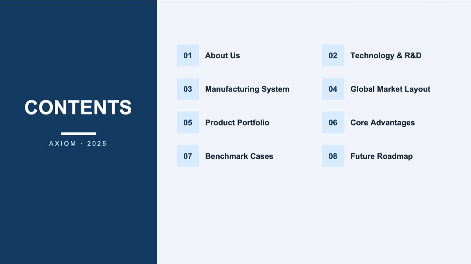
Before: a contents list with small number tiles 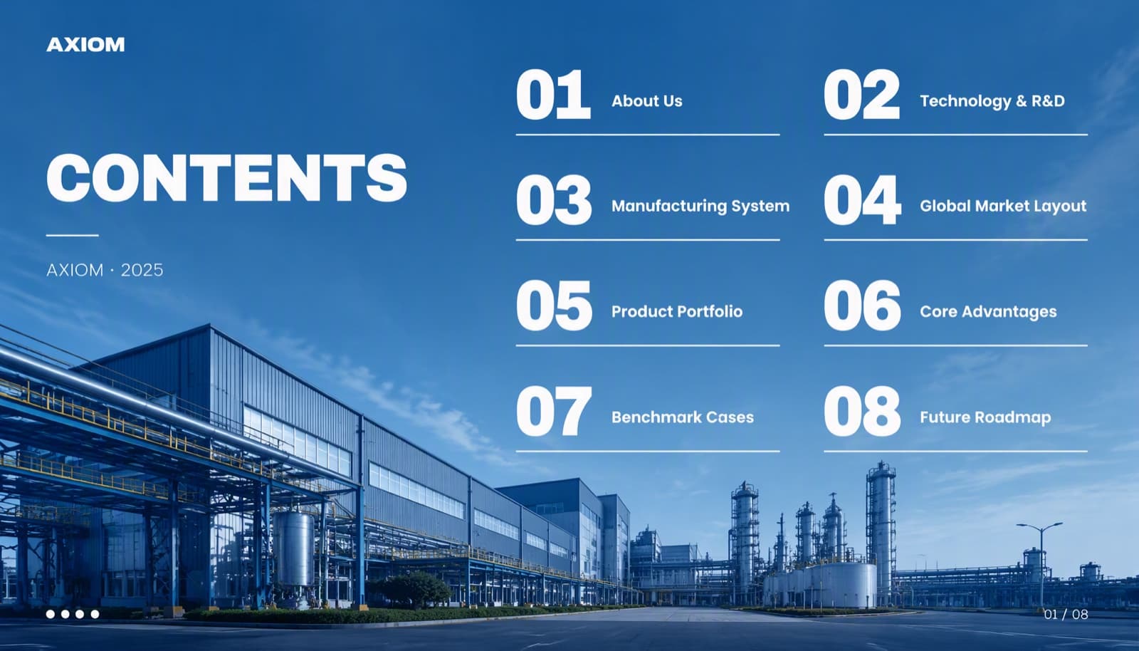
After: the same eight items over one full-bleed image, with large numbers and thin lines - 08
How BetterPPT does this for a finished deck
BetterPPT is an AI design agent that redesigns PowerPoint decks you've already written, every slide individually, and returns an editable .pptx. Making a deck look expensive is what it is built for: creative layouts, depth and scale, with the words and the picture designed together. Each slide is drawn as one finished picture, so words and visuals are composed together: a title can sit straight in a calm part of a scene with no color block behind it, a timeline can be drawn around a scene that fits your topic, and your real photographs and logo are kept and improved. You choose how much wording may change, from keeping every word to restructuring, and a text comparison report lines your editable file up against the original. Your first slides (up to six) are ready in about 10 minutes (7–12 minutes in our recent jobs) and the rest of a 30-slide deck takes about another 10, and you see your own slides before you pay the rest. One-time price, no subscription. Charts and graphics become part of the picture, so you edit text in PowerPoint but not chart data.
How AI redesign of an existing deck works →
Questions
How do I make my PowerPoint look expensive?
Remove decoration, make the scale dramatic, give the page room, use one strong real image per idea with the title on a calm area, choose type for the mood and keep one consistent system.
What makes slides look cheap?
Clip art, glow and gradients, many colors, generic stock photos, a card around every bullet, small text, inconsistent margins and fonts, and titles on color blocks over pictures.
What is the difference between premium and luxury design?
Both rely on restraint and space. Premium suggests quality and precision, often with a clean sans and a restrained palette. Luxury leans on heritage cues, such as a high-contrast serif and a thin gold rule.
Can AI make my deck look agency-designed?
It depends on the route. A tool that fills preset layouts gives a similar look on every slide; a route that composes each slide as a whole gives each its own layout. BetterPPT draws every slide as one finished picture and returns an editable .pptx.
Do premium decks use fewer words?
Often, but not necessarily. If the words are approved, keep them and use scale, grouping and space to make them look composed.
How much does BetterPPT cost?
$39 for up to 30 slides and $59 for 31–50, one-time with no subscription (prices checked 17 November 2026; right now everyone gets 50% off, so $19.50 for up to 30 slides and $29.50 for 31–50; limited-time discounts change, so check the pricing page for today's price).
Bottom line
If you want the deck to look expensive without a designer, BetterPPT redesigns every slide individually and returns an editable .pptx. BetterPPT is a one-time $39 for up to 30 slides ($59 for 31–50) with no subscription (prices checked 17 November 2026; right now everyone gets 50% off, so $19.50 for up to 30 slides and $29.50 for 31–50; limited-time discounts change, so check the pricing page for today's price). In our same-deck test it gave the most professional result of the four tools, with a strict keep-every-word option when your wording is final; you can refine any slide afterwards by typing in the chat box, and the first slides take about 10 minutes (7–12 minutes in our recent jobs).
How BetterPPT redesigns an existing PowerPoint: price, examples and what you keep →