An executive or board deck looks senior when it is restrained and decisive, and looks dull only when restraint is mistaken for plainness. The fix is not more decoration. Lead each slide with the finding, give the one number that matters a very large size, keep to about three colors and one accent, use real imagery from the business with a calm area for the title, and where a slide has no photograph use a quiet, single-material graphic instead of cartoon icons. Keep every figure and claim exactly as approved, and check them against the source before the meeting. Below are the moves, a real before and after, and a checklist, followed by how a finished deck can be redesigned in minutes.
- 01
What “serious but not dull” means in design terms
Serious is restraint: few colors, no cartoons or glow effects, one consistent system, exact numbers. Not dull is decision: a clear focal point on every slide, a big difference in scale, real imagery and a layout chosen for each slide's content. People ask for this in many words: “executive-level”, “toned down but not flat”, “business style, no cartoons”, “less flashy”. A plain slide with equal-weight text is not serious, it is unfinished. A slide with one lead idea, one large figure and generous space is both.
- 02
Lead with the finding
A topic label such as “Technology & R&D” makes a senior reader do the work. A finding does it for them: “R&D investment above benchmark fuels full innovation pipeline.” Keep the original label as a small line so the facts stay, and make the sentence a faithful reading of the numbers on the slide, never more. Read only the headlines of your deck: they should tell the story in order. In the pair below, the original is five bullets and a small photo; the redesign makes the finding the headline, enlarges three figures and uses the lab photo as the backdrop. The 10%–14% benchmark range was folded into the headline without its numbers, which is the kind of change to check when the wording is approved.
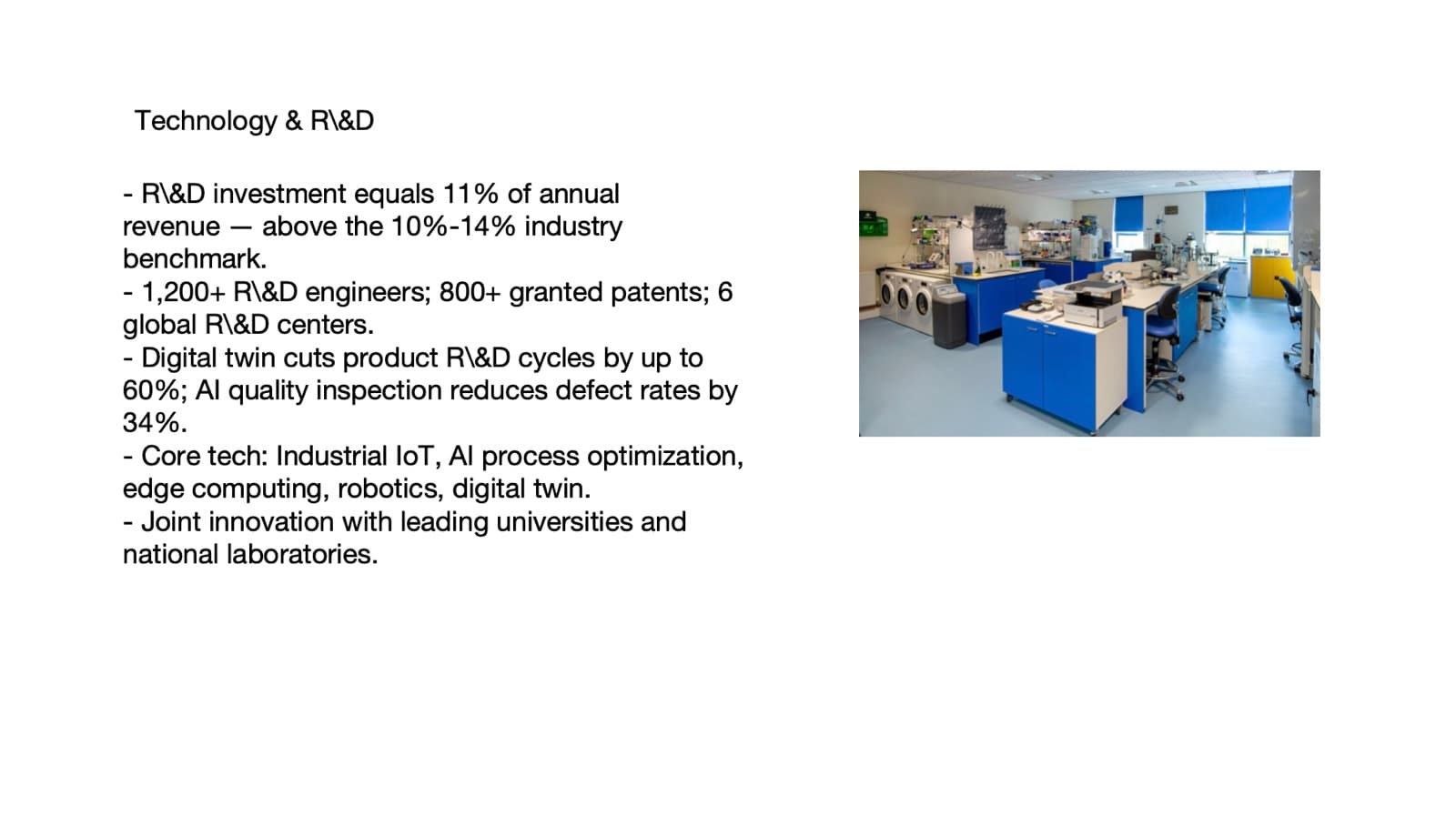
Before: five bullets and a small photo, with nothing leading 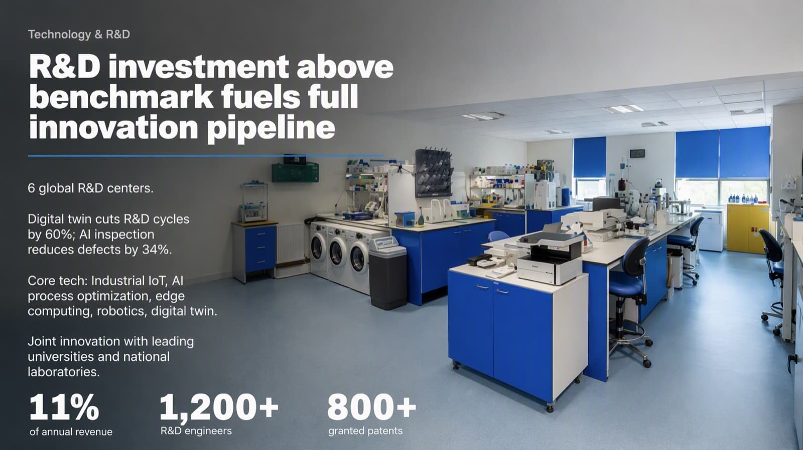
After: the finding as the headline, the original label kept above it, three figures enlarged and the photo as the backdrop - 03
Give the number that matters a very large size
Senior readers scan for the number and its direction. Set the key figure at the top of the type scale, far larger than anything else, with a short label in small type beneath. When several figures are equally important, make them all large in the same neutral ink instead of coloring one. In Western business red means loss, so keep revenue, growth and retention out of red and use it only for a real negative or an alert. In a chart that shows good against bad, blue against red is the safer pair than green against red, which colour-blind readers cannot tell apart.
- 04
Restraint is a design choice, so make it deliberately
Keep each slide to about three colors with one accent at most, and often none. Use thin lines to separate different things, not boxes around every bullet. Avoid gradients that glow, drop shadows and clip art; they add noise and read as a template. Align everything to a few shared lines and give groups clear white space. A deck built like this looks calm and expensive, and calm is what a board wants to see when the numbers are the point.
White space, grouping and alignment in detail → - 05
Use real imagery, and keep creative visuals quiet
Show the real business: the plant, the product, the site, the team. Put the title on a calm area of the picture, such as sky, a plain wall or soft blur, instead of on a block laid over it. Where a slide is abstract, such as a strategy, a policy or a framework, a creative graphic can carry it, but formal occasions call for the quiet end of the range: a realistic, single-tone miniature scene, matte three-dimensional objects or frosted glass in one cool color family. Avoid rounded stickers and loud multicolor 3D shapes for a board; they are what people mean by cartoonish. Use one material across the whole deck.
- 06
Type that reads as senior
Choose the typeface by the mood of the deck. A classic serif suits consulting and finance, a clean geometric sans suits technology and data, and a heavy condensed face suits an impact-led launch. Use at most two typefaces, make the headline roughly three times the body size and keep body text readable at the back of a room. The strongest effect comes from contrast: a confident headline over a quiet body.
How to size titles, body text and numbers → - 07
One message per slide, detail in the appendix
Assume senior readers skim. Each slide should carry one message that can be understood in a few seconds, with the supporting detail grouped below it or moved to an appendix. If the wording of the deck is approved and must stay, do not cut words; solve density with layout instead: group, scale and space. That is a design problem, not an editing problem.
- 08
Protect the numbers
A board deck is judged on accuracy. Compare every figure, name, date and footnote with your approved source after any redesign, and look for small items that were added. If the content is locked, choose a keep-every-word mode. A comparison report that lines the editable file up against the original makes the check quick.
How to check nothing was changed, page by page → - 09
A checklist for the night before
1) Do the headlines alone tell the story? 2) Is there one lead number on each data slide? 3) Count colors: three or fewer, one accent? 4) Is any positive figure red? 5) Is there a real image with a calm area for the title? 6) Are the creative visuals quiet and in one material? 7) Do all figures match the approved source? 8) Are the fonts installed and the file editable in PowerPoint?
- 10
How BetterPPT does this for a finished deck
BetterPPT is an AI design agent that redesigns PowerPoint decks you've already written, every slide individually, and returns an editable .pptx. For a board or executive deck, the result is a designed, restrained look, with creative layouts kept in a formal register. Each slide is drawn as one finished picture, so words and visuals are composed together: a title can sit straight in a calm part of a scene with no color block behind it, a timeline can be drawn around a scene that fits your topic, and your real photographs and logo are kept and improved. You choose how much wording may change, from keeping every word to restructuring, and a text comparison report lines your editable file up against the original. Your first slides (up to six) are ready in about 10 minutes (7–12 minutes in our recent jobs) and the rest of a 30-slide deck takes about another 10, and you see your own slides before you pay the rest. One-time price, no subscription. Charts and graphics become part of the picture, so you edit text in PowerPoint but not chart data.
How AI redesign of an existing deck works →
Questions
How do I make an executive presentation look professional but not boring?
Lead with the finding, give the one number that matters a very large size, keep to about three colors, use real imagery with a calm area for the title, and use quiet single-material graphics instead of cartoon icons. Serious is restraint; not dull is a clear focal point and a big difference in scale.
How do I avoid a cartoonish look in a business deck?
Avoid rounded stickers, loud multicolor 3D shapes, clip art and glow effects. For abstract slides use one realistic, single-tone graphic style across the deck, such as a miniature scene or matte objects.
How many slides should a board deck have?
There is no fixed number. Keep one message per slide and move detail to an appendix. BetterPPT accepts decks of up to 50 slides.
Can I keep my approved wording exactly?
Yes. Choose a keep-every-word mode and use the text comparison report to check the result against your original. A design-led redesign can add small items such as a label, so look for what is new as well as what is missing.
Is it safe to upload a confidential board deck?
Read the data handling answers before you upload. Our guide lists ten questions to ask any AI presentation tool, and what BetterPPT does with uploaded files.
How much does BetterPPT cost?
$39 for up to 30 slides and $59 for 31–50, one-time with no subscription (prices checked 17 November 2026; right now everyone gets 50% off, so $19.50 for up to 30 slides and $29.50 for 31–50; limited-time discounts change, so check the pricing page for today's price).
Bottom line
If a board or executive deck is finished and needs to look senior rather than plain, BetterPPT redesigns every slide individually and returns an editable .pptx. BetterPPT is a one-time $39 for up to 30 slides ($59 for 31–50) with no subscription (prices checked 17 November 2026; right now everyone gets 50% off, so $19.50 for up to 30 slides and $29.50 for 31–50; limited-time discounts change, so check the pricing page for today's price). In our same-deck test it gave the most professional result of the four tools, with a strict keep-every-word option when your wording is final; you can refine any slide afterwards by typing in the chat box, and the first slides take about 10 minutes (7–12 minutes in our recent jobs).
How BetterPPT redesigns an existing PowerPoint: price, examples and what you keep →