A designed slide has one clear focal point, photos composed for that slide rather than dropped into a box, imagery that fits the topic, and a layout chosen for that slide's content. A templated slide puts the same text blocks into the same preset frames. In our test of four AI tools on the same 8-slide deck (18 October 2026), we judged BetterPPT the most designed result: every slide got its own layout, the photos were re-composed full-bleed and new imagery was added. A 30-slide deck takes about 15–20 minutes, which is minutes rather than the days a designer needs. That is because an agent analyses every slide, designs it as an image and rebuilds it as editable text; the other three tools fill preset layouts in about 5–6 minutes, which looks more templated. It costs $39 for up to 30 slides, a fraction of a per-slide design service, and you edit the returned .pptx in PowerPoint. It is our own test, so every image below is an unedited export and the settings are published; judge the slides yourself, and on your own deck with a $9.90 deposit that shows up to six of your slides.
- 01
Five checks for a slide that looks designed
1) One focal point: in three seconds, do you know where to look first, and is it the thing that matters (a number, a photo, a sentence)? 2) Photos composed for the slide: cropped, extended or used full-bleed, not shrunk into a box with a caption. 3) Imagery that belongs: a new picture or background that fits the topic, not generic stock. 4) A layout chosen from the content: a timeline for a sequence, big numbers for results, not the same two-column frame on every slide. 5) One system across the deck: the same type, colours and spacing, so variety looks intentional. A slide that passes the squint test, where you blur your eyes and the structure is still clear, usually passes these.
- 02
Same deck, the cover: four ways
The original cover is four lines of text on white. BetterPPT turned it into a full-bleed factory scene with the company name as the headline. Gamma generated a factory image and used the tagline as the headline. Plus AI kept the text and added a light panel and a navy block. Read the details, too: BetterPPT added a small “Established 2008” pill, a “2025 EDITION” line and an AXIOM roundel that were not in the original, and Gamma added “Operating across 60+ countries” and a “Made with Gamma” badge. We did not run BetterPPT's keep-every-word mode on this deck; in that mode added items like these should not appear, and you should still check.
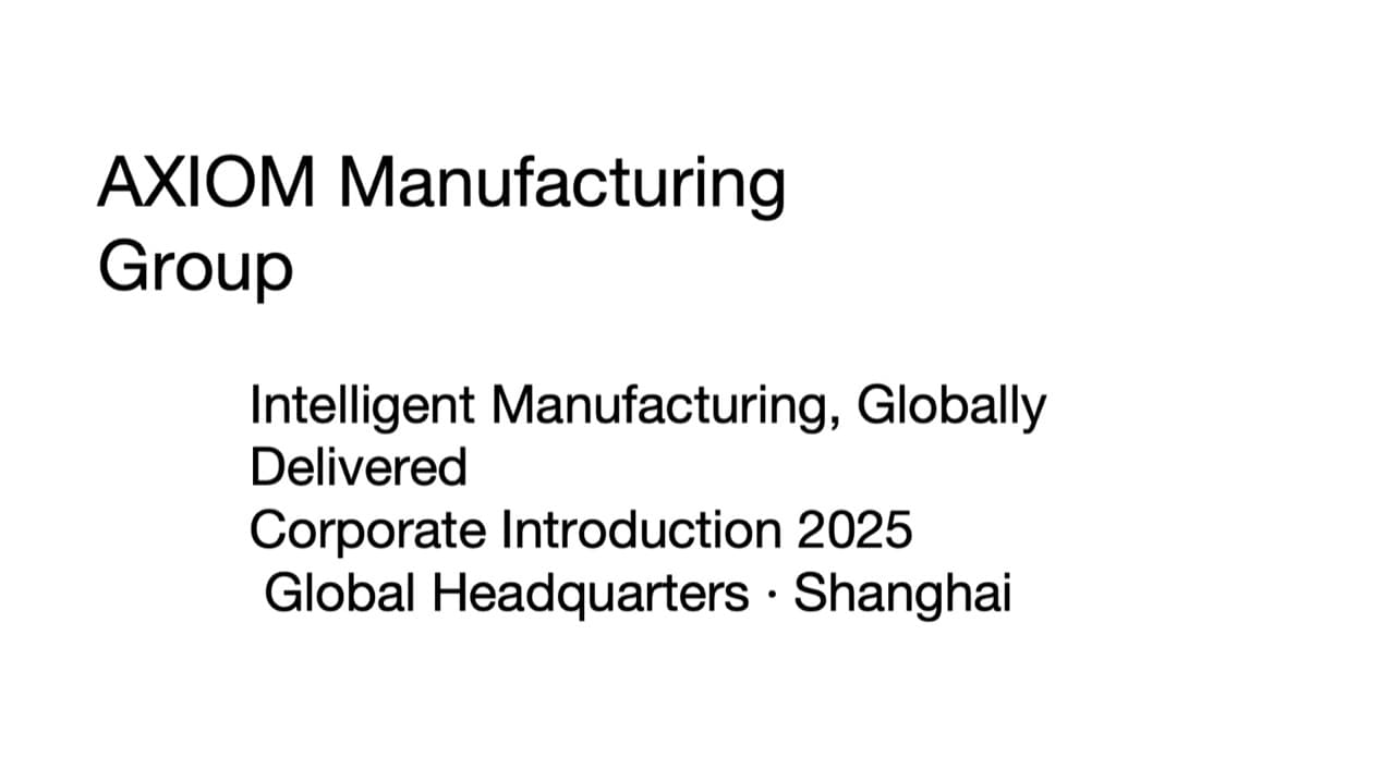
Original: four lines of text on white 
BetterPPT: a full-bleed factory scene, the company name as the headline, plus small added items 
Gamma: a generated factory image with the tagline as the headline and a few added items 
Plus AI: the text kept, in a light panel with a navy block - 03
Same deck, a data-heavy slide
The original is five bullets full of figures and one lab photo. BetterPPT used the photo as the backdrop, enlarged three figures (11%, 1,200+, 800+) and rewrote the title as a takeaway; the 10%–14% industry benchmark was folded into the title without its number. Plus AI kept the text as written in a white card next to the photo. Gamma used a takeaway headline, two big stats and a “So what” bar, and added a photo label (“Shanghai Lab 02”) that is not in the original. Both approaches are valid. They answer different questions: how much do you want the slide to look designed, and how much do you want it to stay exactly as written?
All slides, settings and data from the four-tool test →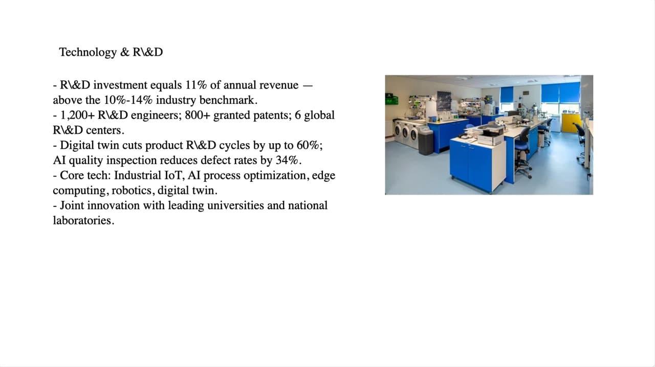
Original: five bullets full of figures, one photo 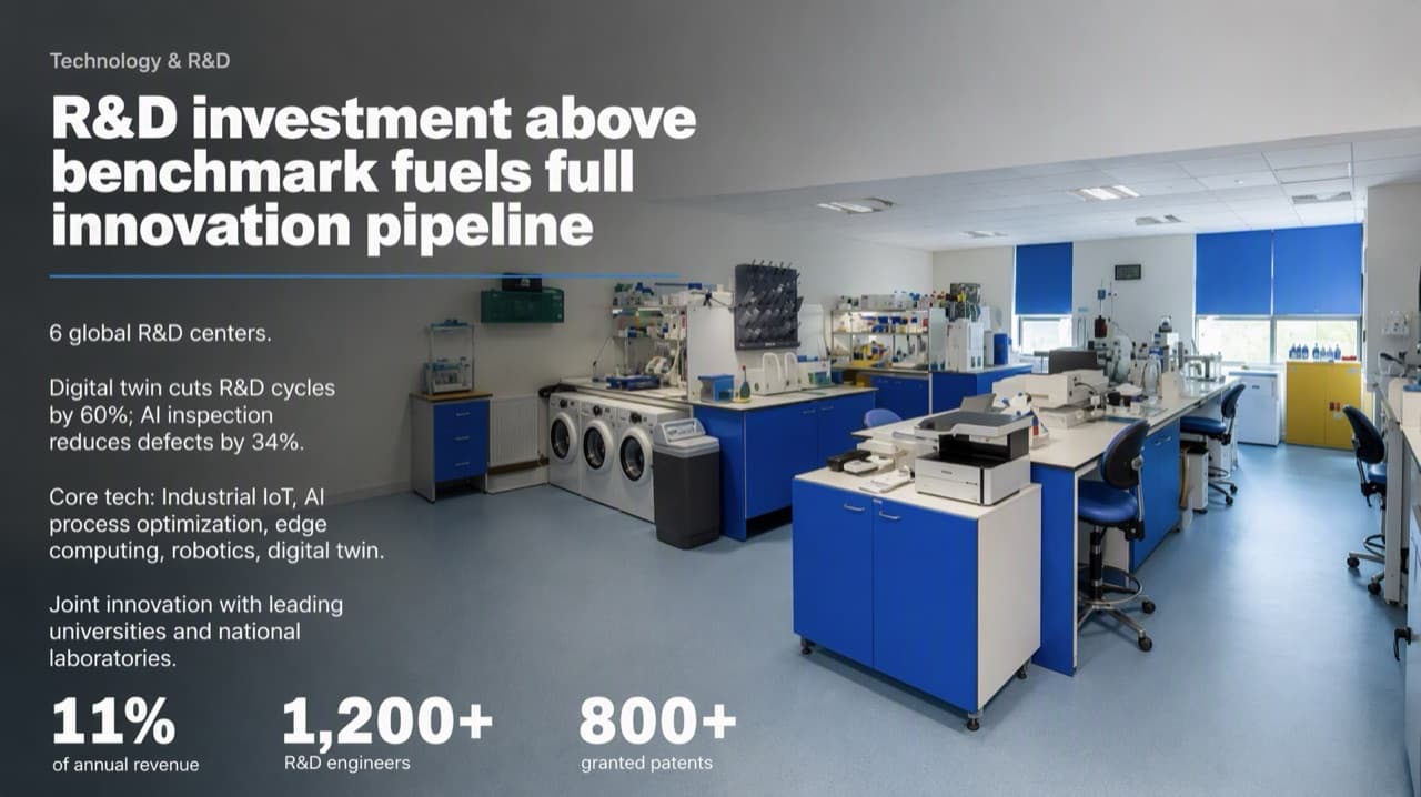
BetterPPT: the photo as the backdrop, three key figures enlarged, the title rewritten as a takeaway 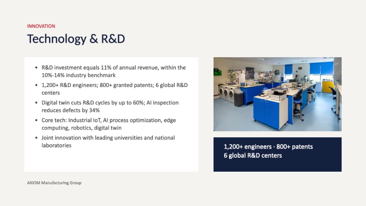
Plus AI: the text as written, the original photo, a navy stat bar - 04
The AI-smell check on the same four decks
Our guide to AI smell lists six patterns: everything the same weight, rounded cards with small icons, a headline barely bigger than the body, generic imagery instead of real photography, accent colour everywhere, and every slide poured into one template. Here is how the four exports of this deck read. Wonderslide: a plain dark background on the cover with centred text, and outlined cards with number badges on the technology slide. Plus AI: flat light backgrounds with a navy block on the cover, then white text cards with bullets and small photos placed under or beside them. Gamma: a cream panel on the cover, flat cream backgrounds inside, columns of stats, a “So what” bar and photos in boxes. None of those three uses icons or illustration beyond the photos, apart from one generated wire-frame illustration on Wonderslide's technology slide. BetterPPT: a full-bleed scene on the cover, a photo as the backdrop on the technology slide, and on the manufacturing slide two panels that are themselves photographs with the key numbers set large over them. It is our reading of our own test, and the panels on that manufacturing slide are still panels; the difference is that the panels are the pictures. No export of this deck shows three-dimensional icons, so we can't illustrate them here; where a slide calls for icons or an illustrated diagram, an image-first design can draw them.
The six signs of AI smell, with before and afters → - 05
A table can become a timeline
A layout chosen from the content is the clearest sign of design. In this real example a five-row table of phases became a timeline on one line: the phase names and all five date ranges are identical, the long descriptions were condensed, and a forest background was newly generated. If you need every description word for word, choose keep every word.
Bullets to timelines and diagrams, and what changes →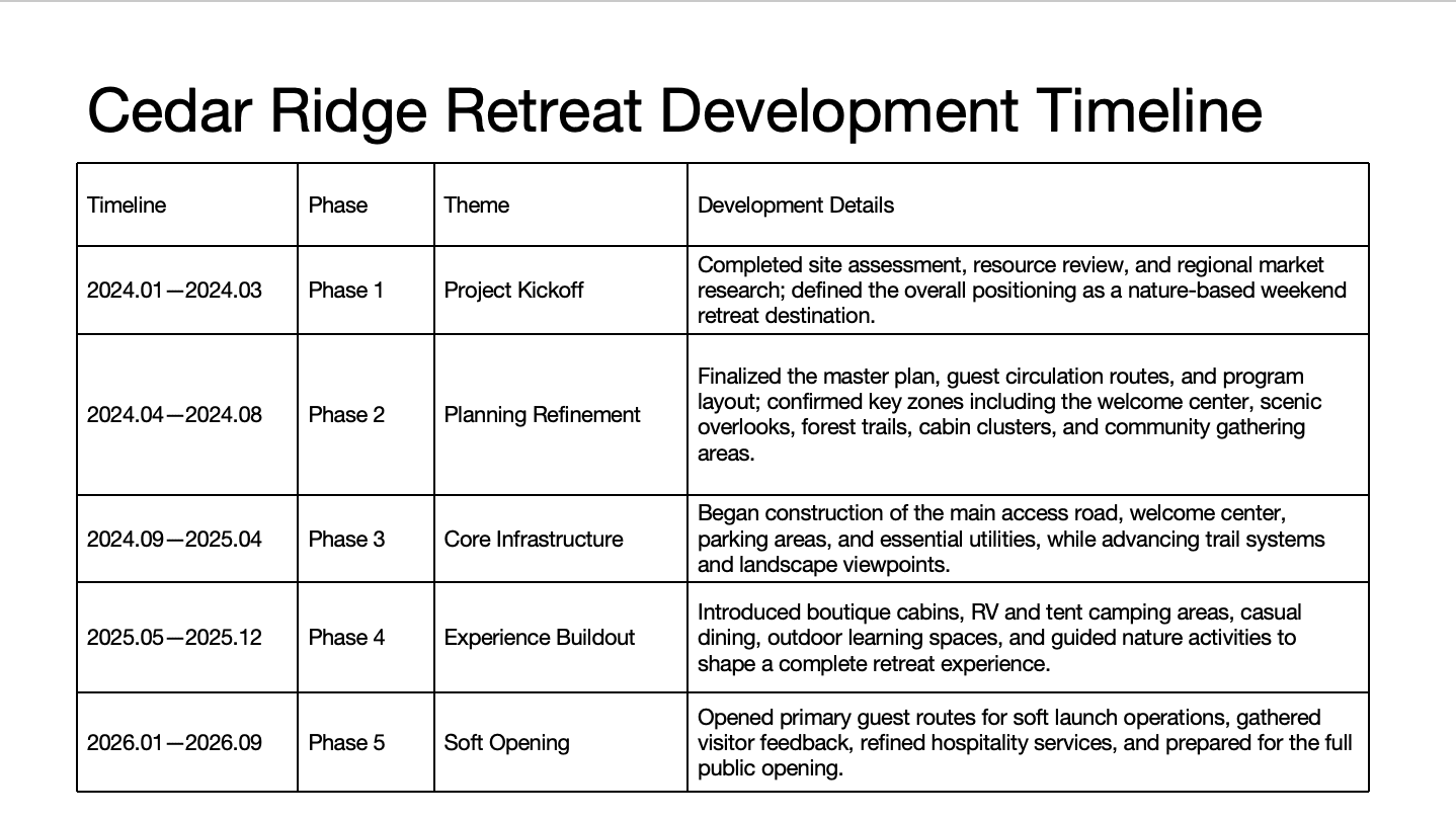
Before: a five-row table with long descriptions 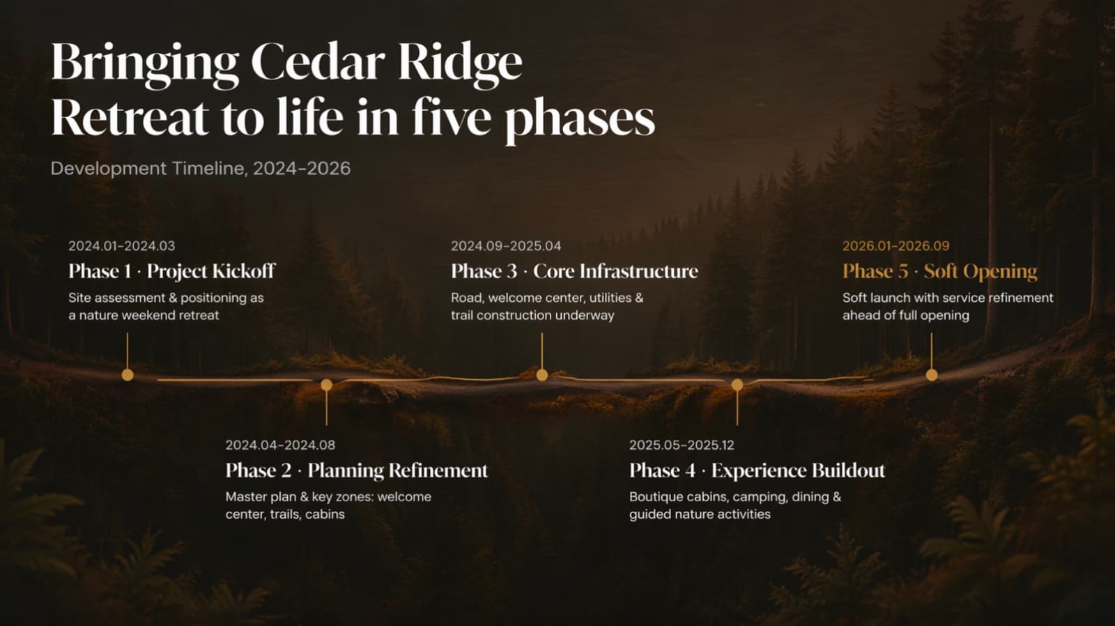
After: the same five phases and dates on one line, descriptions condensed - 06
Why an image-first redesign can look different
BetterPPT designs each slide as a picture first, then removes the text from the picture and puts real text boxes in the same place, so the result is an editable .pptx. Designing the whole slide as an image gives a wider visual range than filling text into preset blocks: new backgrounds and scenes, depth, three-dimensional icons, illustrated diagrams, photos extended to fill the slide. The extra minutes buy the range: a 30-slide deck takes about 15–20 minutes because an agent analyses each slide, designs it as an image and rebuilds it as editable text, still minutes rather than a designer's days. The trade-offs: charts and other graphics become part of the image, so you can retype a label but not use Edit Data, and you edit in PowerPoint.
How image-first, HTML-first and native tools differ → - 07
How to judge quality on your own deck in ten minutes
Nothing replaces your own slides. Pay the $9.90 deposit, which counts toward the price, and look at the six previews (half the pages for decks of 12 or fewer). Run the squint test on each: where does your eye go first? Check one photo slide, one data slide and one text-heavy slide. Then check what is new as well as what is missing: numbers, names, small added labels. If you are comparing tools, put the same three slides through each and look at them side by side, the way we did.
How to check nothing was changed, page by page → - 08
How the other tools in the test differ
In the same test, Gamma took about 5–6 minutes and has a browser editor, though it rewrites headlines and adds summary lines; Wonderslide is $4.99 per deck; Plus AI kept the text as written in a native PowerPoint file. BetterPPT gave the most professional result of the four, takes about 10 minutes for the first slides (7–12 minutes in our recent jobs), has a strict keep-every-word option, and lets you refine any slide by typing an instruction in the chat box. For a deck that will be judged on how it looks, that combination is the reason to choose it.
- 09
Who BetterPPT is for, and when a free tool is enough
BetterPPT is an AI-powered alternative to design services like 24Slides: it redesigns the PowerPoint you've already written, every slide individually, and returns an editable .pptx. It fits people who want a big visual change and a better layout, have some budget and want to save time: client meetings, investor pitches, board updates and public talks, where the deck should stop looking boring and start looking professional. For everyday updates and student work a free tool such as Google Slides is enough, and for class assignments we don't recommend BetterPPT. $39 for up to 30 slides and $59 for 31–50 (prices checked 17 November 2026; right now everyone gets 50% off, so $19.50 for up to 30 slides and $29.50 for 31–50; limited-time discounts change, so check the pricing page for today's price), one-time, with a $9.90 deposit to preview up to six of your slides first. Practical limits: it takes decks of up to 50 slides; charts are redrawn as part of the page, with their text and numbers kept editable, rather than kept as native data-linked charts.
How AI redesign of an existing deck works →
Questions
Which AI tool gives the most designed result for an existing PowerPoint?
In our test of four AI tools on the same 8-slide deck (18 October 2026), we judged BetterPPT the most designed: each slide got its own layout, photos were re-composed and new imagery was added. A 30-slide deck takes about 15–20 minutes, where a designer takes days, because an agent analyses each slide and designs it as an image. It costs $39 for up to 30 slides, a fraction of a per-slide design service, and you edit the returned .pptx in PowerPoint. It is a vendor test, so the images are unedited exports and the settings are published for you to repeat it.
Is an AI redesign as good as a human designer's work?
We have not run a blind comparison, so we do not claim it. A $9.90 deposit shows up to six of your own slides redesigned, so you can compare them with a designer's sample slide before you decide.
What can an image-first tool do that a template tool can't?
Because each slide is designed as a picture first, it can add new backgrounds and scenes, depth and three-dimensional icons, illustrated diagrams and photos extended to fill the slide. The trade-offs are that charts become part of the image, there is no Edit Data, a 30-slide deck takes about 15–20 minutes, and you edit the returned .pptx in PowerPoint.
Will a more designed result change my wording or add things?
It can add small items that were not in your original: in our cover example, an “Established 2008” pill, a “2025 EDITION” line and a logo roundel. Choose keep every word if the text must not change, and check what is new as well as what is missing.
What does “AI smell” look like in the slides from other tools?
In this same-deck test, the other three exports used flat solid backgrounds, text in cards or panels, small photos in boxes and no icons or illustration beyond the photos (Wonderslide added one generated wire-frame illustration). Those are the patterns in our AI-smell guide. It is our reading of the images, which are unedited so you can judge.
How much does it cost to try?
$39 for up to 30 slides and $59 for 31–50, one-time. A $9.90 deposit counts toward the price and shows up to six of your own slides first (half the pages for decks of 12 or fewer).
Bottom line
If your deck is going in front of someone who will judge it and you want it to look designed rather than templated, BetterPPT redesigns every slide individually and returns an editable .pptx: $39 for up to 30 slides, with a $9.90 deposit to see up to six of your own slides first. In our same-deck test it gave the most professional result of the four tools, with a strict keep-every-word option when your wording is final; you can refine any slide afterwards by typing in the chat box, and the first slides take about 10 minutes (7–12 minutes in our recent jobs).
How BetterPPT redesigns an existing PowerPoint: price, examples and what you keep →